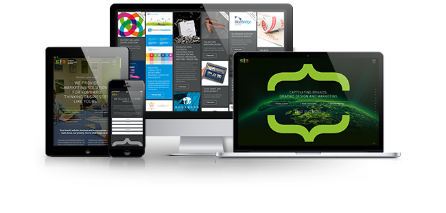
5and3: What is a responsive website design?
The intelligent way to deliver online content
Website design for mobile, tablet, desktop and HD TV
![]()
Optimised viewing experiences
Increased conversions
A responsive website provides you with an optimised viewing experience, the best experience for the device you're viewing on. They adapt to different devices and screen resolutions, maximising viewable space by expanding and re-ordering valuable content.
Responsive websites also allow the user to read content faster and seamlessly without the need for tapping or zooming and importantly, for those data conscious users, images are optimised for speedier page loads and improved SEO, saving time and stopping your customers from becoming bored and leaving for your competitors' website; increasing conversions.
How responsive websites work:

Google's search algorithms place greater emphasis on responsive websites and user experience.
Websites that provide a great user experience will be ranked higher in search results, meaning that your website, if designed and developed well, will appear higher when customers are searching for your services.
The importance of website design
Your website says everything about your brand and business whilst enhancing customer loyalty. It should be user focused. Products and services need to be easily found, both through search engines like Google and Bing, as well as throughout the website itself.
If a user can’t find your products or services through search engines then your website has failed. If a user stumbles across your website looking for a particular product or service and cannot find either within a few seconds then it’s failing. It is not providing a good user experience and so your customers will leave and find your competitor's websites instead.
Furthermore, Google places greater emphasis on user experience, and websites that provide a good user experience will be ranked higher in search results than those that don’t.
There are a number of elements that can affect user experience: Poor User Interface Design (UI), poor User Experience design (UX), slow page speeds from badly written code and/or non-optimised imagery, badly written or lack of content; and importantly, whether the website is designed to work on modern day devices such as high definition displays, desktops, laptops, tablets and mobiles.
We call this responsive website design and it is critical in achieving a successful website. Unfortunately, we see all of the above far too often and that’s why our customers come to us for knowledge, advice and website services.
Website design terminology
You're probably pulling your hair out trying to find the right web design agency. After all, there’s a market full of ‘website designers’, but that’s the point, they’re designers and not a team of website experts who specialise in SEO, Development and design.
We’re the experts, a collection of designers, developers, programmers and search engine experts whose philosophy is to educate. We understand that the web industry can be one of wonder and mystery to those not indoctrinated into it. We prefer to educate our customers rather than have them feeling nervous and insecure when commissioning such work.
The web world is full to the brim with jargon, emerging technologies and do's & don'ts. So please, allow us to cut through the jargon, illuminate the technology and reveal our best practices for producing an award-winning website.

![]()
“You thought Google translate was good?” Say hello to 5and3 translate
Website design jargon buster
Let's tackle the acronyms and initialisms of website design jargon. You may have come across a few of these in your journey across the internet trying to find the right web company to design and build your bespoke website:
Let's go from the top then shall we?
UX
UX stands for "user experience." We know, us web types are crazy, not even using the first letters anymore. As you can probably guess, UX is used to describe the user's experience when they interact with your site. An example of a good user experience may be as simple as ensuring the navigation is easy to find and understand. It could also be something more advanced like warning the user that they may lose data if they exit the page.
UI
UI stands for "user interface." Most of what a visitor will see when they open your site is UI. Everything from your form to your navigation bar is a part of your UI.
UEO
Now that we've met UX and UI we can meet their baby UEO. UEO stands for "user experience optimisation." UEO is the improvement of the user interface (UI) in order to improve user experience (UX). As a by-product of this you will achieve higher rankings in search engines.
SEO
SEO stands for "search engine optimisation." As you've probably guessed SEO is the optimisation of your website to improve rankings in search engines. SEO and UEO are close buddies. As search engines become "bigger, better, faster, stronger" they are paying less attention to optimisations made specifically for search engines and looking more at how good a user’s experience will be.
CRO
CRO pronounced "crow" stands for "conversion rate optimisation." Getting "conversions" literally translates to "getting a user to do what you want."
Although mind control is frowned upon in most societies it would be a brilliant aid in improving conversions. Since you and we don't have access to such technology we have to make do with conversion rate optimisation (CRO).
Conversion rate optimisation (CRO) is essentially getting your visitor in the door, down the isles and to the till as quickly and painlessly as possible. You want them to be as efficient in purchasing your product, submitting their email or even reading a specific article as possible.
Understanding front-end from back-end development
Now that we have a basic understanding of our crazy letter combinations, let’s move onto terminology that you’re most likely to be presented within a website estimate or specification, front-end and back-end website development:
Front-end website development
Imagine you've just walked into a restaurant. You see waiters and barmen, the decor is stunning and the atmosphere is comfortable.
This is what the restaurant would refer to as their ‘front of house’. Essentially everything that you, as a customer can see and interact with will be done via their ‘front of house’ team.
It is exactly the same with a website. Everything your user can see and interact with on your site is dealt with on the ‘front-end’.
‘Front-end’ is just a web developer term for referring to customer facing. Thankfully for you, we haven't managed to come up with an acronym for it yet.
Back-end website development
If the ‘front end’ is the decor and the waiting staff then the ‘back-end’ is the kitchens and back office.
The ‘back-end’ deals with the heavy lifting, for example, it would handle a customer’s order made ‘front of house’ by transferring that information to the chefs in the kitchen.
That unnoticed quick and seamless interaction between front and back of house is what makes the process work. Payments made using the customer’s card are processed by technologies and applications that go unnoticed, seamlessly and without hitch, that’s ‘back-end’ programming.
Your website will need some form of ‘back-end’ programming to either interface to a third-party payment provider or even a stock control or content management system.
![]()
PHEW!
That was a lot of technical jargon to wade through and we're glad we made it to the other side. You now know the acronyms, buzzwords and jargon when it comes to responsive website design and development.
Benefits of working with 5and3
Whether you’re a ‘startup’ looking for an award-winning responsive website solution or existing business who needs a website redesign that delivers results, then why not choose us?
We’ll not only create an ‘eye-popping’ design, captivating online user experience and fully integrated solution, but we’ll develop the website with code that future proofs your investment; continuing to work with you during the launch, as well as ongoing promotion of your website, brand and business to generate leads, improve sales and increase revenue.
How much does a responsive website design cost?
The minimum investment for a bespoke website design is £5760. Ultimately though it is up to you, as with buying a car you get what you pay for. The higher the investment the more features and better performance you’ll receive. We tailor our solutions to your budget, but more importantly, we provide consultation to calculate your return on investment.
Our driving motivation is to generate quality leads and sales for your business that far exceed the cost of a website. Therefore, it becomes a no-brainer for you to invest in an award-winning website. Who wouldn't want a website for the fraction of the cost of a sales team that brings in regular leads and sales?
How can we prove that our websites provide a return on investment? Well, it's complicated but we can. To find out more please read this article Website. Investment. Asset
Unsure how much you should spend? Let us help you decide, read more about how much a website costs here, or, if you know your budget and are already excited about working with us then get in contact with our friendly team who will be happy to arrange an informal consultation.
examples of successful responsive websites
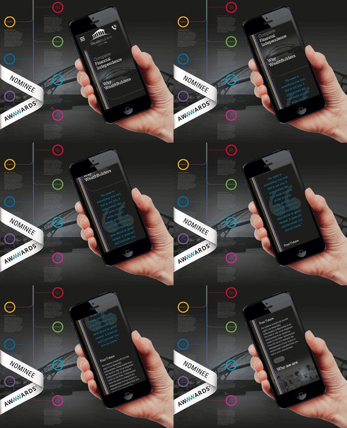
Wealthbuilders: Brand & bespoke website design
Brand & website positioning for Surrey based Chartered Surveyors
Brand & online tools for sales and growth
Interested? Let's chat
Chat with one of our team or start your project today


