Designing a brand, user journey and bespoke website
The Result
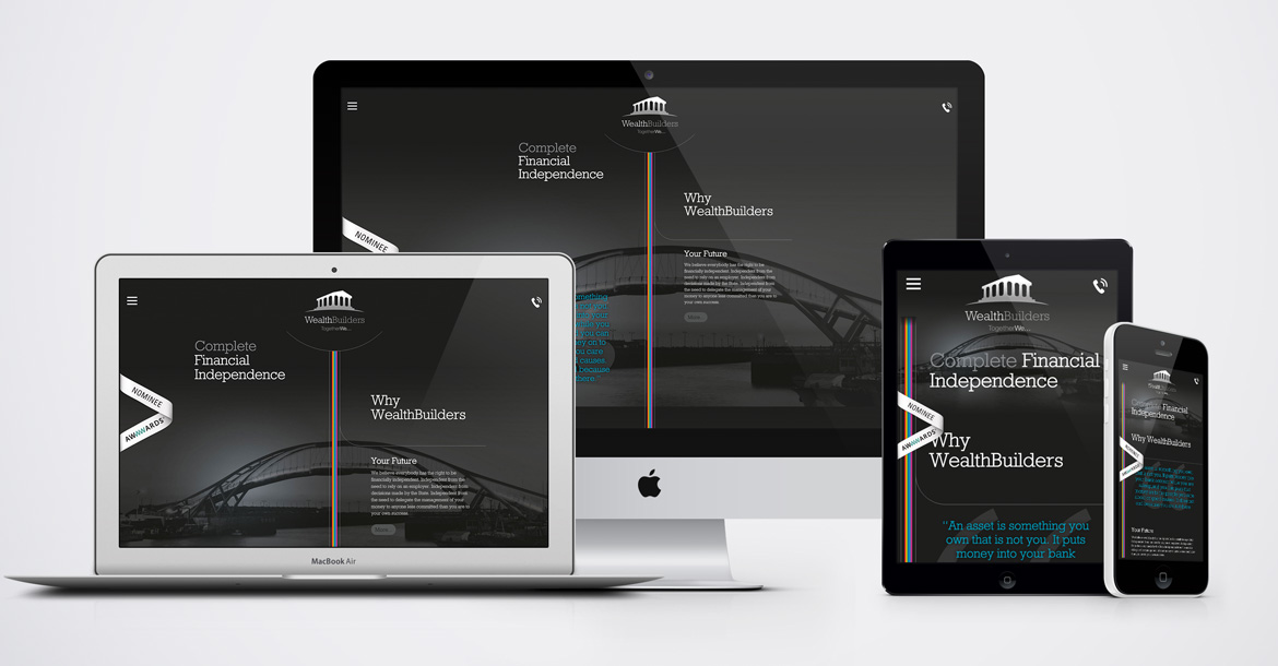
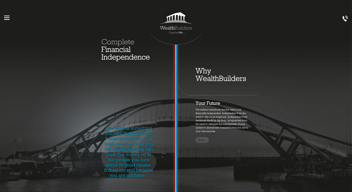
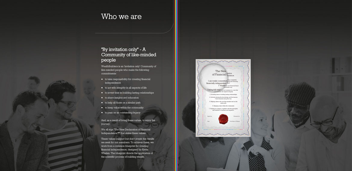
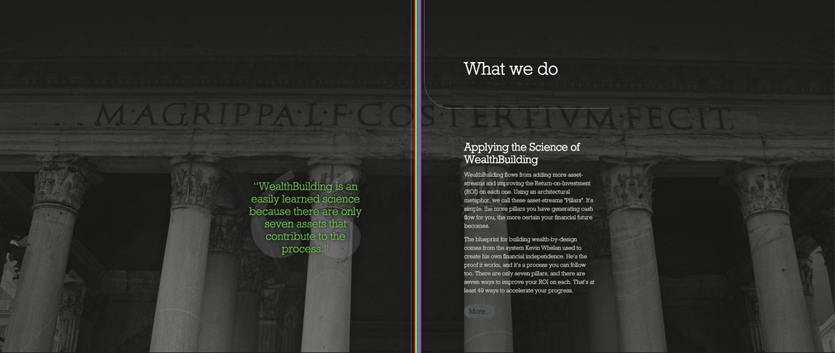
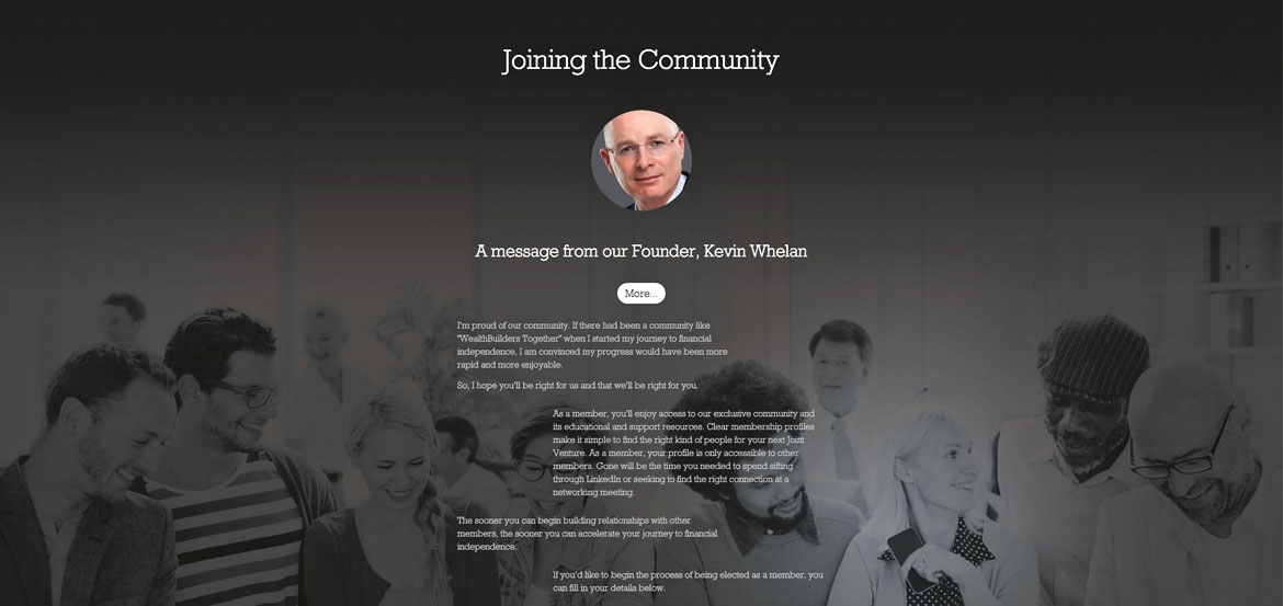
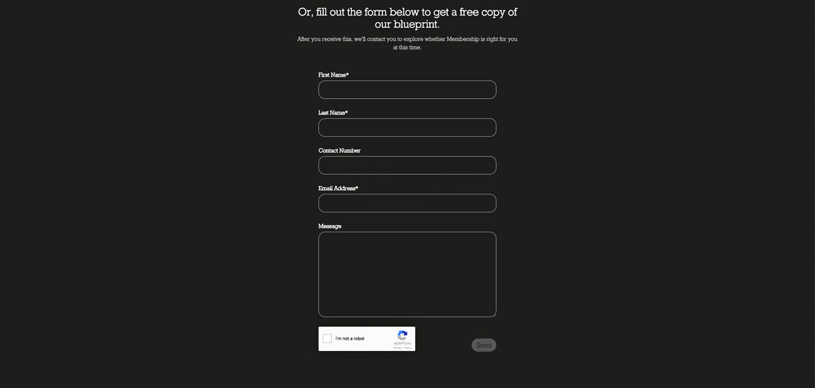
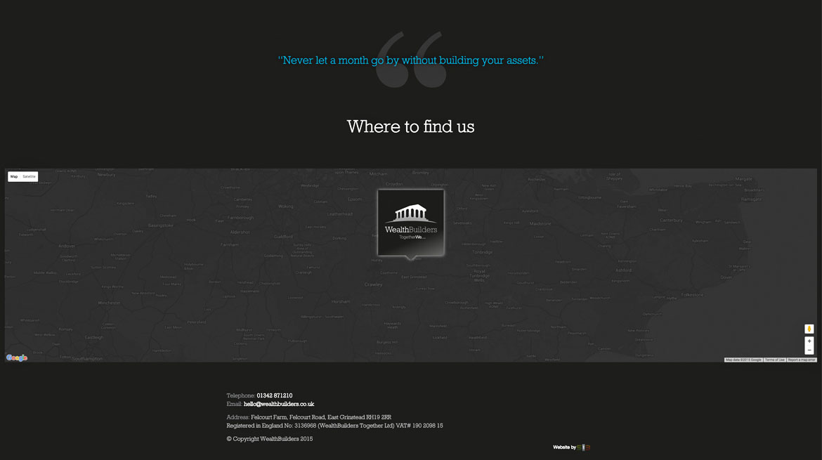
An exciting and unique Awwwards nominated responsive website design that gives the user an intuitive digital journey experience. The website responds to all devices (mobile, tablet, desktop) seamlessly, and performs excellently in Google's search rankings with good semantic mark up, fast page load speeds and images that are optimised for the device viewed upon.
View the WealthBuilders website
The Brief
WealthBuilders, based in East Grinstead West Sussex commissioned us to design a journey led website and brand identity that was in line with their' strategic model and business philosophy.
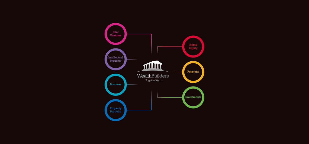
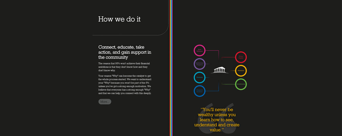
The website would be used to educate and grow a community of like minded individuals, on a personal journey towards complete financial independence through 7 pillars: Joint Ventures, Intellectual property, Business, Property, Home Equity, Pensions and Investments.
Services
- Brand identity
- Responsive website design
- Website development
Industries
- Finance
- Wealth Management






Our challenge
Following on from our initial involvement with the creation of their brand logo, stationery and book design, we created a visually stunning concept for depicting WealthBuilders' 'MindMap.' The 'MindMap' contained the components that made up the process of becoming a WealthBuilder and helped towards creating financial independence.
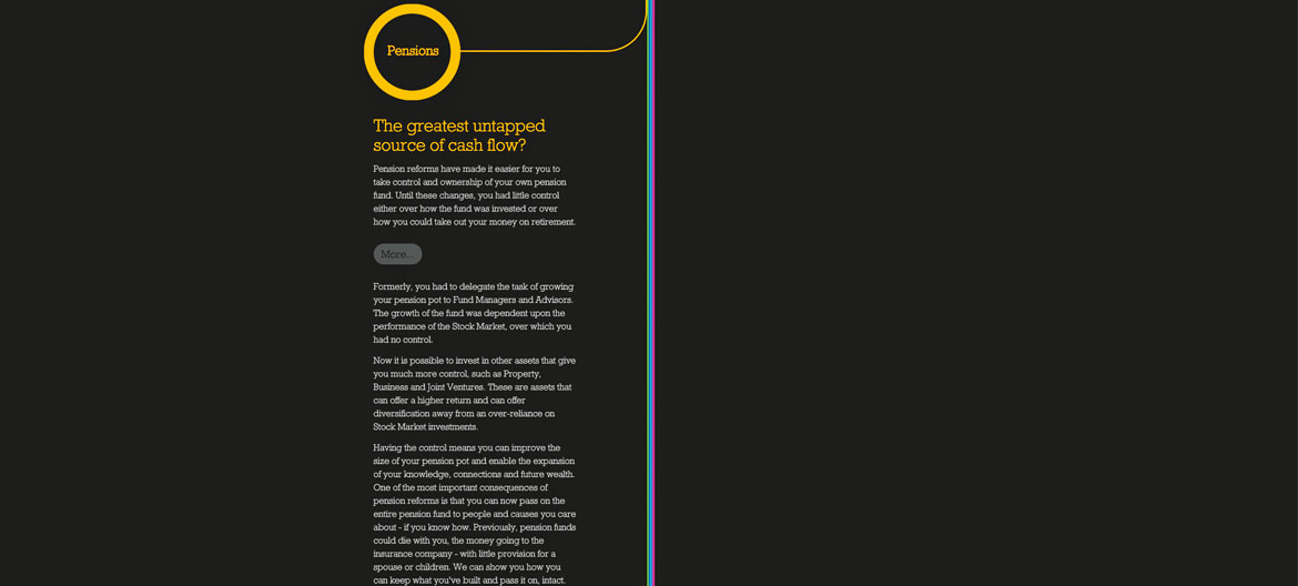
Consisting of seven coloured assets, the 'MindMap' was an intrinsic part of WealthBuilders' communications. It would become the critical part of the website design and content delivery as it would take the user on a journey through the ideology that is WealthBuilders.
The challenge for our East Grinstead based creative and web design team would be in depicting the 'MindMap' visually in digital form on a resposnive website.
How could we create this in an exciting and engaging way, with added content and detailed information of the' who', 'why', 'how' and 'what', in order to take the user on a truly intuitive journey into the mindset of financial independence?
Our response
We took the original square form 'MindMap' design and spanned it vertically to ensure that users would follow the journey logically, arriving at each one of the seven pillars/assets in the correct order. This gave us the perfect way to handle large amounts of content by showing/hiding information with the use of accordions. This was important as the amount of information available would have led to a rather long list of website content, dominating the screen and making it less engaging and intuitive for the user.
The most important element of spanning vertically was also so that we could develop a responsive website, and with intelligent code, many hours developing and testing, we created a website and 'MindMap' journey that worked from top to bottom on all devices.
What was really clever about this, besides how great the website looked, was that the 'MindMap', made purely from CSS code, was fast to download and an the overall user experience was and still is seamless.
