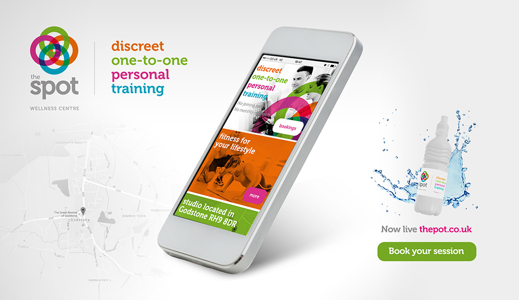
View The Spot Case Study
The creative process
The first step (after receiving the initial brief from the client, 'Nick') was to have a business consultation in the comfort of our design studio. From that initial meeting I gained a clear understanding of Nick's vision for the company and laid out the goals we would achieve moving forward.
The meeting was invaluable, as is often the case in a pre-project meeting, because our thoughts, ideas and passion were evident in allowing us to explore initial ideas. I left the meeting enthused and excited by the creative and technical challenges that lay ahead.
Rubbing my hands together about planning the deliverables and budget that would be required to launch a new brand for this local startup business. Following the submission of our proposal and budget, the planned brand & marketing deliverables were greeted by our client with a resounding, ‘yes! We need them all!’
Once the project was booked into our schedule, I then set about working on the initial branding concept ideas that I'd formulated, encapsulating the vision Nick and I had discussed.
Initial brand concept ideas
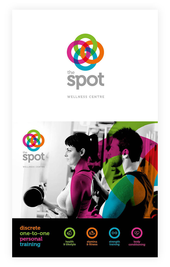
Target market – The concept that we feel is right for the intended audience
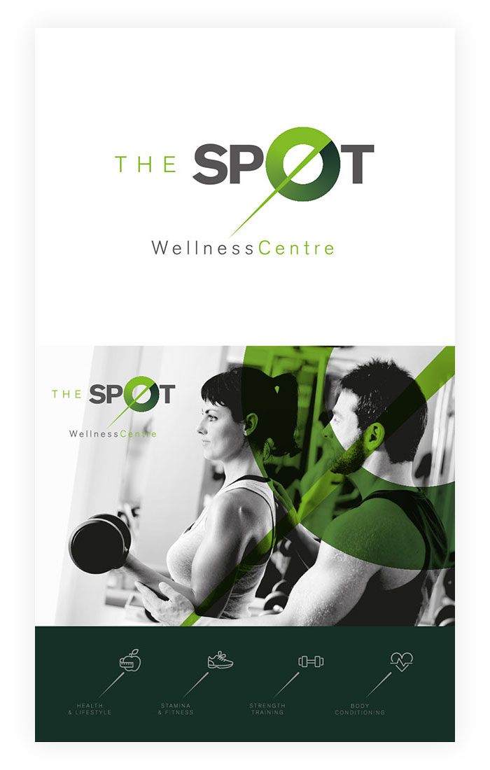
Safe (Client) – Usually a concept that the designer produces to appease the client’s original ideas
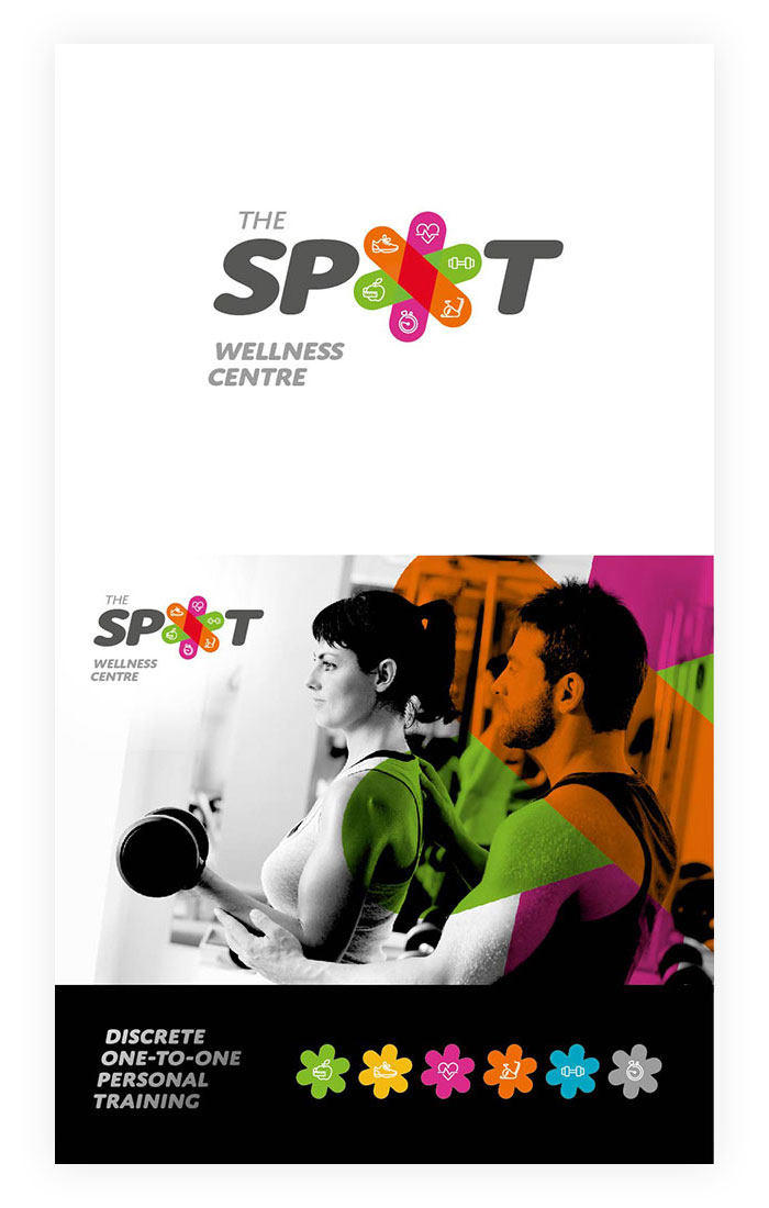
Designers – A concept that the designer explores to ensure they are entirely satisfied with their best ideaa
Some immediate hurdles!
“The initial problem for any creative director or graphic designer is to understand the client’s expectations and requirements. What they, the client, believes to be right for their business doesn’t necessarily mean what is right for their intended audience. In this instance, Nick’s original thoughts for the brand were to use a similar style to that of his existing business Profound, with the difference being the images and colour. Orange was mentioned as a potential replacement for Profounds green, but, I had other ideas!”
Client concept feedback
Three ideas were submitted for feedback and as often happens, there were likes and dislikes with all three brand concepts.
Nick suggested tinkering with the concepts to try and get certain aspects of each to work together as one. This isn’t uncommon.
My previous experience working closely with customers has shown that when the client has an opinion for certain aspects of each design, they tend to combine all parts they like into one concept.
Invariably this doesn’t work because the three concepts are truly unique and by trying to combine or force them together usually causes conflict or unbalance. Sometimes though, even I can be proven to be wrong! I helped Nick understand this problem and after explaining the differences in each concept and how they would and wouldn’t work together we came to a compromise where we were both happy.
We, as designers, go through this process to ensure the customer can see the problems we face, allowing them to understand the impact their decisions may have on a design, whilst at the same time always wanting them to be happy and satisfied with the final result. See below for visuals from the attempted tinkering.
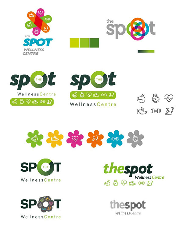
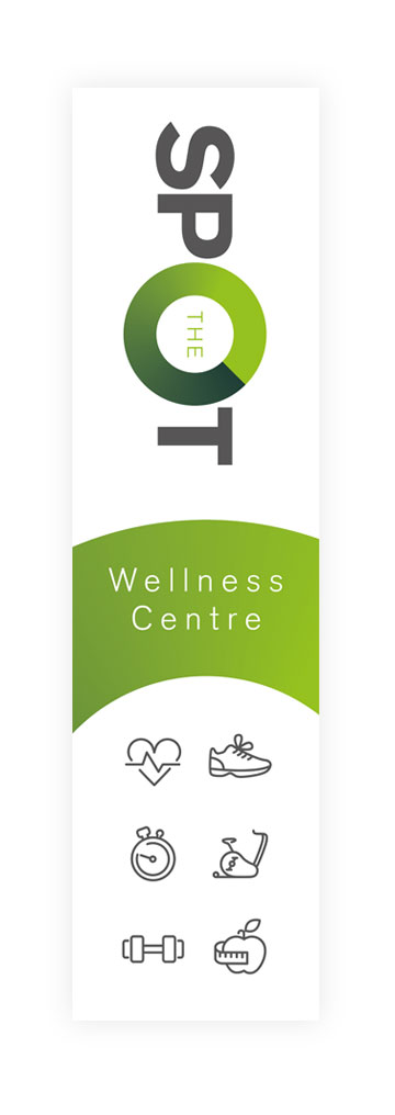
“I like the that one, what do you think? Can we try seeing what it looks like on a flag?”
I quickly created a rectangle flag based on the logo Nick preferred, to prove that it wasn’t right.
"What do you think?"
I examined the new design. Shedding the bias of personal preference and trying to look at it from the point of view of the target audience specified in the brief.
“It doesn’t work for me Nick I’m afraid. It’s not right for your target market”
Following a short discussion referencing the original brief and based on the process that we’d just gone through, Nick simply said:
“Ok, you know what? You’re the expert and so I’ll leave it with you to do what’s right.”
Well, the right thing to do was to get some valuable feedback from his target audience. I had a general idea of the right brand direction, but we had to ensure that it appealed to women.
There was a clear winner in the end having asked many women, my wife included, which their preferred concept was.
Chosen concept
Now that a had 100% backing from our client and we were convinced that my preferred concept was going in the right direction, I evolved and developed the brand concept further prior to submitting the final idea to the Nick.
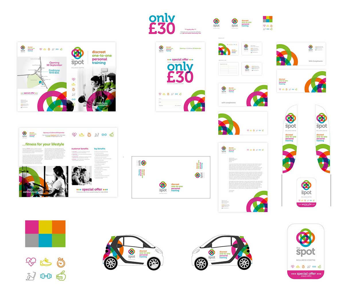
Above is an art-board that demonstrates the creative workings of how a brand should be consistent across their marketing collateral.
This is my 'workings' art-board and not the final conceptual proposal that was submitted to the client. Unfortunately, I cannot show you that as it contains sensitive information, however, should you wish to engage with me on a branding project, you will get to see a full brand proposal from me or my team of brand experts.
Final Brand delivery
From consultation and briefing, concept to design development, I finally reached the point where I successfully delivered a brand identity, responsive website and marketing collateral for our client and all in time for the grand opening launch.
View The Spot Case Study
Quite often, selected concepts will be simplified to become clearer and more distinguished and importantly, for them to work on digital and marketing collateral. Many times have I created a brand, only to revisit it over and over, refining it and simplifying it.
I think that sometimes brands can be overcomplicated, overthought, but there's a balance. Of course, as a brand and graphic designer you're always battling with an endless mind of creativity and a customers restraining budget!
Whether you're a designer or entrepreneur reading this article, good luck and enjoy the branding journey. Maybe hit me up on LinkedIn and we can connect if you'd like some brand advice.
CreateYourBrand™
Does your business or product need to be repositioned? Or are you a startup that needs a new and complete branding package? I have just the product solution for you…
Discover more