The Problem
On the new version of the 5and3 website we have many work projects and case studies for our users to read. Recently, it came to our attention via user testing and statistics provided by Google analytics, that when people were
getting to the end of a project page they were either dropping off the site or navigating away from the page via the main menu. Obviously, these pages were not providing an ideal flow for the
visitor. To help counter this issue in the past, we have implemented next and previous arrows to allow quick navigation between projects. However, whilst providing the user with more navigation
options, this is a "dumb" solution as the next and previous projects may have no relevance to the project they were just reading, or what they were interested in finding when they came to the page.
Our Solution
The obvious solution would be to provide the user with more work projects or case studies to browse through at their leisure.
However, this had the same issues as the backwards and forwards arrows, in that we would be trying to select a few good projects that the user may be interested in.
After discussing, we came to the conclusion that the returned data had to be in some way related to the page the user was
just reading, this led to the idea of a smart related work and case studies area that would be implemented at the bottom of
every work project and case study.
This would hopefully catch the attention of any user that made it to the end of the project and navigate them to another page with content they would be interested in. This would allow users to browse large numbers of projects without pogo-sticking (jumping backwards and forwards from an index page).
Our Implementation
Finding related work projects and case studies was not as simple as it first appeared. Since all of our projects had a very open and dynamic layout there were not many consistent points of comparison to work with. The first step was to identify those common components and decide upon the best way to compare them to other projects.
The consistent points between all of the pages turned out to be:
- Project ID (The slug that appears in the URI)
- Meta page title
- Meta description
- Client name
- Industry list (list of industries the project covers)
- Project introduction

Extracting keywords
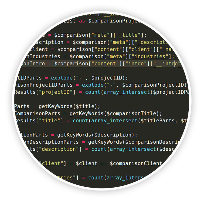
After retrieving each of these points of consistency as raw data, we set about reducing the word pool.
The most obvious way to cut down on the useless words was to target
'transition words' or 'stop' words such as "and",
"is" etc. These words during a comparison are just white noise that would muddy the search results.
For instance we wouldn't want two projects matching because they both contained the word "and" or "because".
In order to implement this effectively we needed to find a high quality word list. Thankfully,
someone else had needed to do this in the past and helpfully provided a snippet with a
reasonably extensive transitional word list.
We then used this list to replace all instances of the words contained within it with NULL (Nothing).
After implementing this filter we checked the quality of the keywords that were being returned
and noticed that some of the raw data contained HTML code, which was being pulled through as keywords.
This was easily remedied via the use of a handy PHP function called 'strip_tags'.
Upon evaluating the keywords after all of the above, a reasonably consistent word list was starting
to develop. One issue that we noticed fairly quickly was singular and plural words. Plural words like
"logos" and "developments" were competing with their singular counterparts in the results. We didn't want one project to
have an advantage in the rankings over another just because one of them used both the plural and singular versions of the
word. This issue was a little more tricky to resolve as the english language isn't the most consistent thing.
After a little research we came across a handy 'class' made by Konsta Vesterinen and Jonathan H. Wage of the
'Doctrine project'. Their class called 'Doctrine Inflector' had multiple text formatting options such as
changing strings to class names, camelcase, table names and most importantly for us, making plural strings singular.
The next issue to tackle was punctuation. Words at the ends of sentences were being bundled with the
full stops, words that were indicating lists still had the colon attached. To remedy this we used a
regular expression to filter out all characters that weren't letters or numbers.
Finally, to ensure consistency across all of the words in our list we converted all of the characters
to lower case. This stopped instances where "Branding" was being treated differently to "branding".
Now that we were left with a list of reasonably consistent words we could scan the list for duplicates.
Since we were only producing a simple comparison engine, we didn't need to take into account the number
of occurrences of a keyword in each area so we just processed the list which ensured all words were unique.
Comparing keywords and weighting results
The next step was to begin comparing the sets of keywords we had extracted from each of the
consistent areas of the projects.
At first we considered compiling all of the keywords into one list and then again running
through the process of removing duplicate results. After seeing what the scores for the comparisons
were like we realised a flaw in this plan; not all keywords should be counted as equal i.e. a match
that had been made in the projects introductory text should not be as important as a match made
in the title or the projects ID. After making this realisation we needed to come up with a simple
way of weighting the results.
The formulae we came up with was surprisingly simple:
Number of keyword matches × weight defined by importance = Similarity Score
After we had calculated a similarity score for each of our distinct areas, we could then get their
sum as a total similarity score for that project. We could then utilise this total score and compare
it against a perfect score i.e. a project compared to itself. This produced a percentage which
we could use to order and select the most similar projects.

Finding and removing outliers
After some testing and attempting to work out why some projects were being related to other
projects, we realised a slight flaw. We couldn't easily jump between projects looking for issues
because we couldn't tell why projects were being chosen! To remedy this, we threw together a
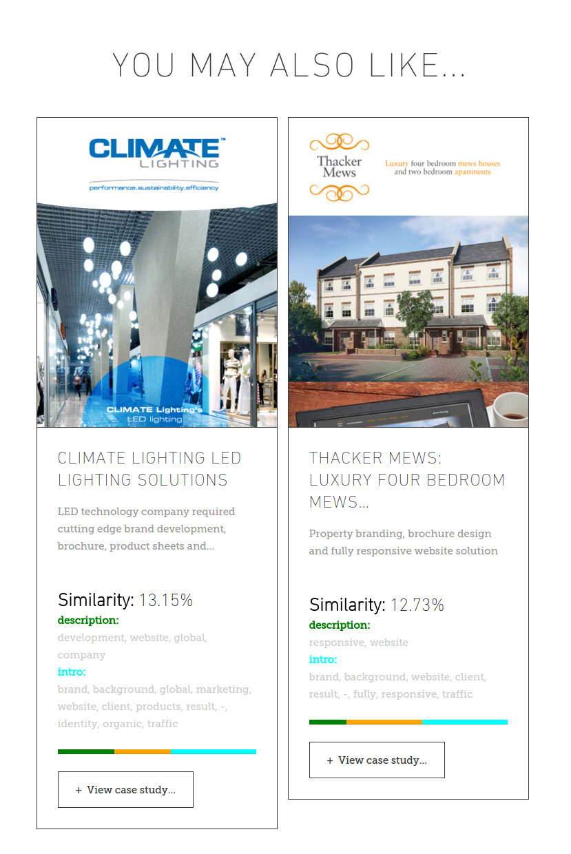
simple statistics view to be temporarily displayed below our results, that showed valuable and important
information, such as:
- Percentage similarity
- List of keywords matched for each section of the page
- How much those keywords affected the overall score
This allowed us to trawl through the results for most of our projects and tweak the transitional
word list and the weight each section had in the overall score.
In Conclusion
We have created an interesting way for users to navigate around our projects pages, which would
improve the flow from those pages and improve the user's overall experience. Hopefully,
this would also improve the SEO/UEO for these pages by improved inlinking.
See for yourself, view one of our captivating website projects now