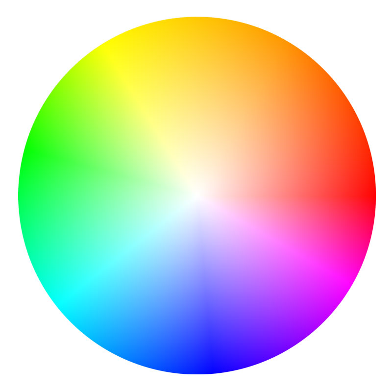
Design trends and cultural associations can influence our colour choices
Most elements of our sensory environment can be assigned a colour. Whether
consciously or on a subconscious level, we project colours onto the people
we like and dislike and have colour associations with situations we'd rather
forget or would like to remember. It not only plays a big part in defining
our self image, but our underlying moods, hopes, fears, likes and dislikes
are often assigned colours of their own too.
Some colours we are strongly drawn to; others we consider feminine or
masculine, lively or subdued. These associations are a complex mix of
personal association and preferences. They also have deep cultural roots
and are swayed by trends.
Colour psychology and colour symbolism are considered
’soft science'.
Mainstream psychologists have reported that most evidence points to a lack
of a single, universal reaction to any particular colour. However, as colour
association often happens subconsciously, these subliminal responses can have
a very real effect on the viewer's interpretation of what they're seeing.

Colour choice might be just one component to consider when creating an
overall brand identity, research has found that it has the most significant
impact on the consumer. Studies by the Institute for Color Research have
found that in the first 90 seconds of observing an item, the viewer has
already made a subconscious judgement - up to 90 per cent of which is based
on its colour. These are startling results for designers. When branding
your company, a product or service, it would be impossible to take into
account the myriad of personal colour associations your audience may have -
but a basic awareness is still essential.
Research has shown that when consumers scan the shelves in supermarkets,
they do so by looking for brand colours, not brand names. This reinforces
the findings by the Institute for Color Research in regard to the immediate
impact of colour on the consumer. Competitor brands often use this behaviour
to their advantage, by adopting competitor brand colours. It seems to be
fair game within the retail market, and something that's done to great effect
by most of the major food chains. Many store-branded goods mimic the
packaging and labelling of national brands, drawing the consumer's attention
to them and manipulating their association, thus placing the products on a
more equal footing with the larger, established brands.
Research by the University of Loyola
also found that colour increases brand awareness by 80 per cent.
As an integrated communications agency,
we call upon much of this research when creating or working with brands.
It's important that clients aren't automatically dismissive of a particular
colour due to personal preference before preliminary research has been
undertaken, as this personal choice may rule out the most appropriate colour.

In many cases colour choices can be influenced by current market trends and
can be selected or rejected due to the association with other established
brands. This disassociation with competitor brand colours is quite clearly
displayed within the mobile phone market, where the four major UK phone companies
are easily distinguishable by their colour branding: O2 is blue; T-Mobile
is pink; Orange, orange; and Vodafone, red. Each has their own distinct and
separate brand colours, although on a basic level each company offers essentially
the same products and services.
Once a colour has been defined for a brand, it's a good idea to set aside a
wider palette of complementary colours that allow for versatile use across
various media, and are also available to assign to sub-brands or other
products. It's important to establish these colours as early as possible
in the branding process; if sub-brands are then introduced at a later date,
there can be a seamless link to the parent branding.
Successfully established brands can be recognised from their colour palette
alone and unless colour coding is needed, sub-brands don't necessarily have
to be re-coloured. Virgin holds fast to its well-established red with all
products and services and, in doing so, each new product launched is
immediately associated with the company's existing products and slotted
into the marketplace with instant recognition. This is due to the company's
successful placing of the brands within the cultural environment.
When creating brand palettes, the number of colours required varies,
though as a guide, we usually select between two and four. When designing a
logo that contains multiple colours, it's important to consider how it will
appear when reproduced in a single colour. How a logo works reversed out is
also an important consideration.
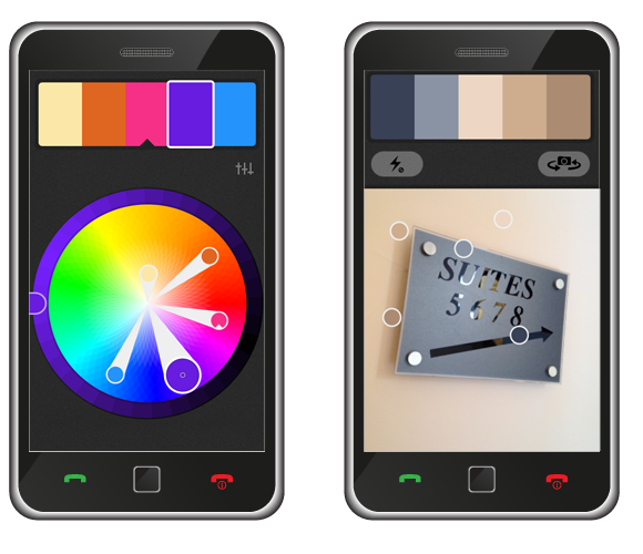
There are several websites that can help you with which colours to choose
when building a brand palette. One of the most useful is
Adobe Kuler, which
enables you to define a palette by entering a base colour. The interface
then selects a colour palette of five colours from one of seven colour rules.
There is also an option to create a palette from an image, as well as a
large selection of themes to choose from palettes that have been uploaded
by the website's community.
